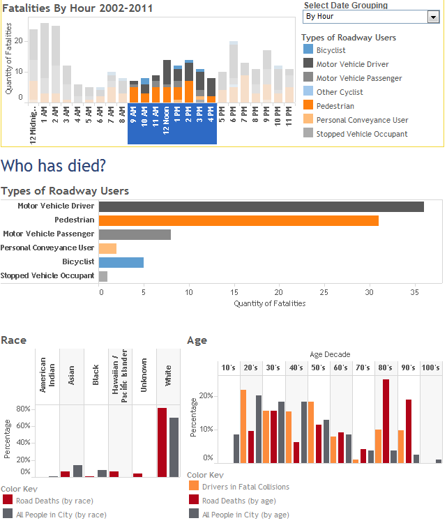
The Seattle Roadway Death Dashboard published here last week combines different sources of data and presents the data through various chart types. This interactive analytical tool provides information on roadway fatalities that could be used to save lives.
Here are some examples of how you can interact with this tool to gain insight:
- During the daytime, people in their 80s and 90s are more likely to be killed in a traffic collision than any other age group. Together, this age group makes up 7% of the total population but accounts for 44% of the fatalities from 9am to 4pm.
[expand title=”see screenshot”][/expand] - Pedestrians 50 and older are disproportionately likely to be killed on Seattle roadways. Pedestrians younger than 50 count for fewer roadway fatalities than expected based on the city demographics. People aged 20-49 account for 58% of the city population but only 41% of its pedestrian fatalities.
[expand title=”see screenshot”][/expand] - As a percentage of total fatalities, black drivers are more than three times as likely to be killed on the roadway than city demographics would suggest. This race accounts for 26% of driver fatalities but only 8% of the population.
[expand title=”see screenshot”][/expand] - Rainier Ave S is the deadliest city street with a speed limit from 20-35 mph by far, but there are several other streets where four or more people have died.
[expand title=”see screenshot”][/expand] - Pedestrian fatalities are fairly evenly distributed throughout the day, while driver and passenger fatalities occur predominantly late at night and in the very early morning.
[expand title=”see screenshot”]
[/expand]
This is just a sampling of the type of analysis you can do with the dashboard. Please share any interesting results you’ve found in the comments.


