Great diagram, thanks! It would be interesting to see if vehicle type had an effect as well. Crash compatibility statistics point to SUVs being 1.7 times more deadly to others than cars: https://en.wikipedia.org/wiki/Crash_incompatibility
This is a really informative set of graphics, to help us understand more about the fatalities that happen on our roadways. Thank you for putting this together.
I want to better understand the graphic of Previous Incidents, related to “Who are the drivers in fatal collisions?” Scrolling down, it seems that a small number of drivers were involved in many, many incidents prior to the fatal one documented here. For example, it indicates that one driver was involved in 27 incidents within the past 3 years, and 675 total before this one. Do I understand correctly that this indicates that this one driver alone was responsible in his or her lifetime of a combined 675 documented incidents of crashes, convicted DUIs, license suspensions, convicted speeding tickets, and other convictions for harmful/illegal use of a motor vehicle?
Good question – that was an error. That one driver had 27 incidents on their record in the 3 years prior to the fatal collision. It’s not recorded how many incidents that driver had prior to that 3-year window.
Interesting graphic, but I know of at least one fatal collision involving a cyclist that isn’t showing on the map. A male cyclist was killed by a car at the intersection of Lake Washington Boulevard South and South Orcas Street in july 2009.
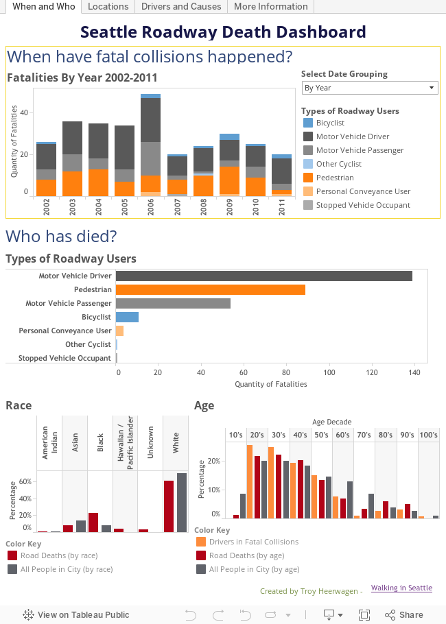
For the “Age Decade”, does “60” represent people in their 50s?
This would indicate that drivers in their 50’s and 60’s are the safest drivers (lower % of fatilities than the % of population their age group represents). Of course it could also just be representative of overall less driving, too.
Good question. I’ve clarified the labeling now so it would show people in their 60s are less likely to be killed on a roadway and less likely to be a driver in a fatal collision than their population would suggest.
People in their 60s are more likely to be a driver in a fatal collision than to be killed themselves on a roadway.


Great diagram, thanks! It would be interesting to see if vehicle type had an effect as well. Crash compatibility statistics point to SUVs being 1.7 times more deadly to others than cars:
https://en.wikipedia.org/wiki/Crash_incompatibility
This is a really informative set of graphics, to help us understand more about the fatalities that happen on our roadways. Thank you for putting this together.
I want to better understand the graphic of Previous Incidents, related to “Who are the drivers in fatal collisions?” Scrolling down, it seems that a small number of drivers were involved in many, many incidents prior to the fatal one documented here. For example, it indicates that one driver was involved in 27 incidents within the past 3 years, and 675 total before this one. Do I understand correctly that this indicates that this one driver alone was responsible in his or her lifetime of a combined 675 documented incidents of crashes, convicted DUIs, license suspensions, convicted speeding tickets, and other convictions for harmful/illegal use of a motor vehicle?
Good question – that was an error. That one driver had 27 incidents on their record in the 3 years prior to the fatal collision. It’s not recorded how many incidents that driver had prior to that 3-year window.
Interesting graphic, but I know of at least one fatal collision involving a cyclist that isn’t showing on the map. A male cyclist was killed by a car at the intersection of Lake Washington Boulevard South and South Orcas Street in july 2009.
For the “Age Decade”, does “60” represent people in their 50s?
This would indicate that drivers in their 50’s and 60’s are the safest drivers (lower % of fatilities than the % of population their age group represents). Of course it could also just be representative of overall less driving, too.
Good question. I’ve clarified the labeling now so it would show people in their 60s are less likely to be killed on a roadway and less likely to be a driver in a fatal collision than their population would suggest.
People in their 60s are more likely to be a driver in a fatal collision than to be killed themselves on a roadway.